We’ve been going through the process of what it takes to make a graphic novel with this series of posts, covering the various steps along the way in a brief overview. We’ve gone through just about all the steps now and end up with one of the last, this being lettering. Now, if you’re looking to do just a black and white book then you could have this step take place right after the inking stage. Also, there are some who look to letter before coloring and others who wish to letter after coloring. You can use whatever order works best for you. Finally, I won’t be getting into the real nitty gritty of lettering either as it can be quite nebulous and that is not the purpose of this series. I can, however, point you The DC Comics Guide to Coloring and Lettering Comics, which should be a place you can dig in for more.
Now, we’ve already talked a bit in the previous posts about what lettering is to some extent, starting with word balloons and captions and how it plays into the script and later page layout. So I’m not going to rehash that too much here either. I’m only going to say that most lettering is done by computers for obvious reasons. One of them is it’s faster and easier to correct mistakes and the other is it allows for a whole host of various options for the letterer to use. Such options are color, font size, various effects (shadows, twisted text, etc.), and a greater ability to save time and money.
Given that much of the process of making graphic novels, at least when it comes time to print, is done with computers it makes even more sense to use computer-based lettering. This isn’t to say hand lettering isn’t still used. There are some companies and places that use it and is sometimes the preferred method by some independent creators.
However you look to get your text incorporated you need to have someone who has a good understanding of how text works. In many cases lettering, like coloring, is a final accent to your work. Lettering can also make the work better and pull things out that would have otherwise been hidden. It also needs to work and help promote the flow of the final piece, that is how it is read by the reader. Simple options like the color of the background balloon, text, and even the size of the font make for a powerful piece of additional dressing to any finished work.
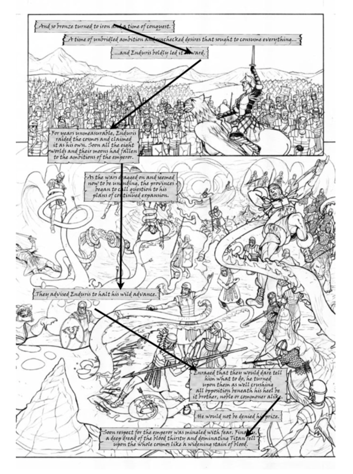
While I’m not going to get too much in the weeds on things, like I said, what I want to focus on in the rest of this post is the use of flow for lettering. Below is a sample page (page one) using simple captions and a common font. Again, keeping in mind that panels, captions, and word balloons share the same reading option of top to bottom, left to right you can follow the arrows as to how the eye flows with the narration.
I share this option as an example of perhaps not the best way to make use of a lettering layout. We had to make due with what we had on this page because I made the rookie mistake of putting in too much text and not having enough space to place it properly. So rather than having the captions cover up some key artwork we had to improvise as best we could. And while it works you can see how it makes your eyes feel slightly uncomfortable as you read it.
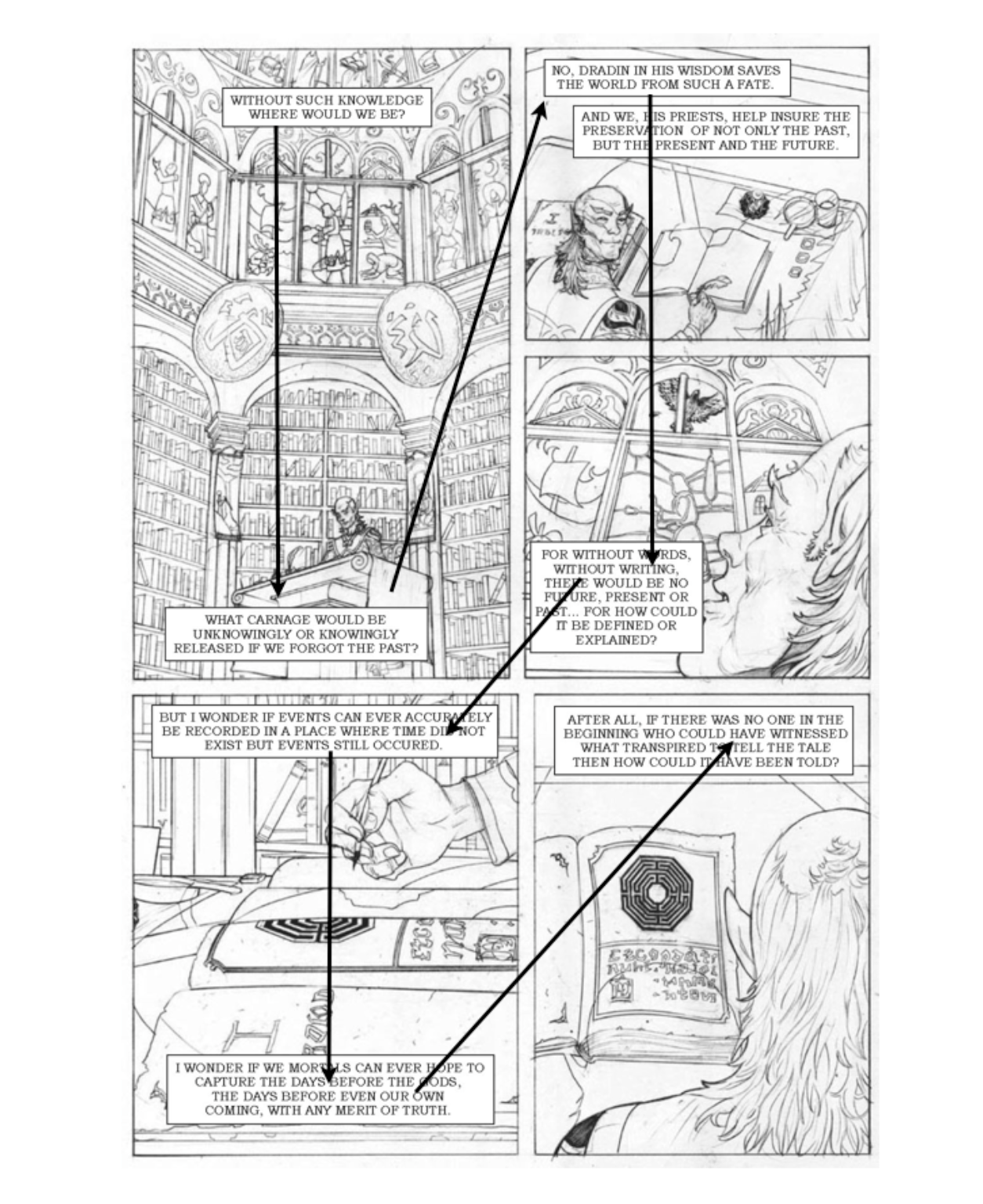
The second page is a better example of how lettering can work in a more optimal way. You can see the letterer has shifted to using more of a handwritten script and made the captions look more like parchments pages. This changes the mood and feel of the text and helps to blend it into the images in the panels as well.
You can also see how the text flows much better in this page than with the former example. It actually feels natural, and better still, pulls you into the panels in a nice, smooth way. It even brings you right into the midst of the action in the second panel; popping certain aspects of the action out in the process. This is lettering working at its best. Where it becomes part of the page—literally part of the artwork itself—and helps to bring the reader deeper into the story and page in general.
Again, these are just two examples of many I could share but I trust with this brief introduction and you getting a hold of that book I plugged earlier, you’ll be better informed moving forward. You should also look at other graphic novels out there, see how they are lettered and by whom (if you’re looking for a letterer for your project). Seeing what else is being done also can inspire you for your own work.
PAGE TWO
PAGE ONE

Get updates on the latest news, book releases, deals, signings, and more. No spam. No hassles. All free. Sign up today.