GRAPHIC NOVELS
PENCILS
In this essay we’re going to keep moving forward on the overview of what goes into making a graphic novel by looking at pencils, the foundation of the graphic novel’s artwork. But before we get to the pages we have to move back a step to developing some thumbnails.
PLOTTING IT ALL OUT WITH THUMBNAILS
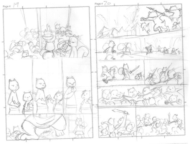
Thumbnails are rough layouts of what a page will look like. As you recalled from the previous essay on scripts each page is broken down into panels, which have to be arranged some way, shape, or form on the page. In most cases how and where these panels are set up is not clearly defined in the script and so left for the artist to decide.
You might recall from the essay on scripts that unless otherwise mentioned none of the panels have a default form. That is they are not defined by size, where they need to be on the page, and other basic layout concepts. This is all handled by the artist, who takes what he or she gets in the script and then adapts it to what they think will be the best overall look on the page.
This is also a collaborative process and so the give and take really begins to develop when you start to see just how a page could or will look moving forward. Many times an artist will see things a writer doesn’t, such as how much space is really needed for a panel. It might be you have too much going on in one panel and so it needs to be broken down into two or more or there are too many panels that really serve no purpose and so could be combined into one.
Again, artists really have the chance to be creative now and play around with ideas here, but it’s important to not got too crazy. I can say from personal experience that some ideas the artist has shared and come up with in this layout stage have been awesome—even better than I thought possible. And other times they just fell flat. Many artists will also offer some alternative versions of the panels to choose from. In this it’s more like setting up the shots for a movie (storyboards and comic pages have much in common there) wherein you’re the director making the final choices.
As you can see in the image below for Sons of Ashgard: Ill Met in Elmgard, the artist has offered his take on how two of the pages should look, based on the script. It is up to me then to decide if they work and more forward from there.
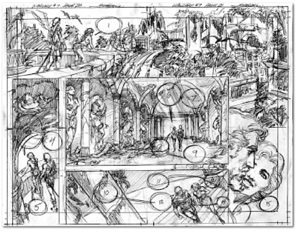
Along with the layout the artist will also put in room for the dialogue and sound effects, captions, and any other elements needed. This makes sure they don’t have to draw something that will get covered by word balloons but also makes sure you don’t have the text crowding out the art or vice versa. Being too wordy in your scripts is a common mistake new writers to graphic novels and comics make. They either put too much into one panel or too much into one balloon or both. You don’t really get the happy medium until you start the layout and begin to see just how much work needs to be done in cutting back and even rearranging/rewriting the text and dialogue to make it fit.
Below you can also see Mike Grell’s pencil layout for a page of The Warlord. He has set aside places on the page to allow for the placement of dialogue to make sure he isn’t covering too much with it and to better draw around it.


THE PENCILS THEMSELVES
Once you get the thumbnails approved the artist takes the images and often through working with a light box or other methods—including using variosu software programs (if drawn digitally) makes them into final penciled pages that can either be inked or considered done or “finished”, depending on what is being sought and the quality of the pencils themselves (all of which we’ll cover in future posts).
The pencils, like we said before, are the start of the visual foundation of the work and will be moving forward. This will be the main way readers will interact with your story so it’s important you are happy with the final pencils since everything and one in the creative team will be building upon them.

